Ontological-epistemological formalizations
April 4, 2016
It seems that the voluminous discussion going under names such as positivism vs. interpretivism, modernism vs. post-modernism, foundatonalism vs. non-foundationalism, and behaviorism, realism and pluralism could benefit from a formalization of the ontological and epistemological models implied by the various positions staked in the discussion. It may be predictably claimed by some of the discussants that the attempt at formalization stakes a position in the contested landscape rather than maps it. I tend to disagree, but do not address this issue. Below is a generic ontological-epistemological formalization framework which allows the description of a wide variety of ontological-epistemological models by setting different values for its parameters. A few specializations, corresponding to radically different situations on the positivist-interpretivist spectrum, are presented.
Setup
Let the “objective, impersonal” universe (that is, all that is observable other than other observers) be a time series of points in an observation space R – r(t) ∈ RT.
In addition the world contains a set of observers I, each with an internal state that develops over time si(t) ∈ S, i ∈ I, t ∈ T. The observations made by each observer at time t depend upon the state of the objective world at this time and upon the state of the observer at the time: fi(t) = f(r(t), si(t)).
The observers can communicate between themselves. These communications are messages of finite length over a certain finite alphabet A, so the communications of observer i at time t is bi(t) ∈ A*. The communication of each observer at each time depend on their state at the time: bi(t) = b(si(t)).
Finally, each observer’s internal state, si can develop based on the observer’s observations and on the history of communications by other observers (and himself): ∆si(t) = s'(si(t), fi(t), Bj(t), j ∈ I), where Bj(t) is the concatenation of all the messages of observer j up to time t: bj(t’), t’ ≤ t.
Read the rest of this entry »
Sanders’s name recognition
February 1, 2016
The chart below shows the growth of Sanders’s name recognition (as well as favorability and unfavorability ratings) over the period March 2015 to January 2016, a period which roughly corresponds to the time between Sanders announcing his candidacy for president and the first primary votes. The data indicates that when Sanders entered the race 60% of the population never heard of him and only about 20% had some sort of an opinion about him. Even in January 2016, about 20% of respondents said they never heard of Sanders.

This can be instructively compared with candidate Obama’s name recognition history, who was unknown to only 15% in March 2007, and was known to all but 3% by January 2008.
Data sources: pollingreport.com, gallup.com.

Geography, income and housing prices in Israel
September 22, 2014
This article follows up on themes discussed here and here by adding data about the association between location and price and income. The data source for apartment prices is a multi-year data set of the Israeli Ministry of Housing and Construction. The data set tracks the average apartment price over time in 74 localities with a total population of almost 6 million. This sample of localities includes all of the large cities plus an assortment of smaller towns. Arab majority towns are not represented.
Between the years 2008 and 2013 housing prices in Israel had increased significantly. The average apartment price rose from about 100 monthly salaries in 2008 to about 130 in 2013.
 Figure 1
The location-associated data shows (Figure 1) that the price increase can be described well as a proportional increase of about 30% plus an offset of about ILS 200,000. Read the rest of this entry »
A new version of this.
This has a revised Analysis section discussing the zero interest rate lower bound scenario and a new section showing a parametric example of the model including an illustration of the resulting functional relationship between the money supply and production.

The figure below shows the frequency of certain types of words in inaugural speeches of U.S. presidents. The three types showed are words beginning with the string “elect”, words beginning with “repub” and words beginning with “democ”. Around the middle of the 20th century the “elect” and “repub” types were largely abandoned while the “democ” type became more prominent.

The Data was extracted from the texts of the speeches as found on the website of the “UCSB presidency project” using an R script.
Algorithms for kids
February 15, 2014
I recently gave a talk about algorithms to a 6-th grade class. My slides are below (an English version and a Hebrew version).
What I believe worked very well was going through the execution of the algorithms step-by-step and having the kids take turns at saying in advance, before I switch to the next slide, what the changes they are expecting see are – where the instruction pointer arrow will move, what variables will change their values and what new output will be emitted.
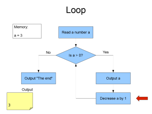 English version
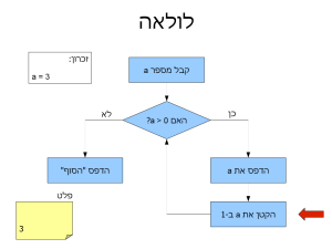 Hebrew version
About learning
February 3, 2014
I have spent my childhood and adolescence implicitly believing in ideas about learning that in later life I have come to disbelieve. It appears to me that those ideas are quite common in our society, including among schoolchildren. These false ideas cause significant harm to many of those who believe in them and, being widespread, to society. I therefore think it is important to disabuse students, and particularly children, of these ideas.
The false ideas about learning maintain their hold in the mind of the public mainly because they are rarely examined. One of the false ideas is that the nature of learning is self-evident and needs no examination. This, of course, makes those ideas self-reinforcing.
This essay is a brief description of those erroneous ideas about learning and of an alternative view – in my opinion, the correct view. To make things concrete, I start by listing a set of practical implications of the rejection of the false notions and adoption of the alternative view. These are things that can and should be done by the various people involved in education – students, teachers, and managers of education systems.
Housing prices, rent, salaries and interest rate
January 31, 2014
This post presents some additional time series regarding the matters discussed in a previous post. In addition to using the data used in the previous post, one additional series is used – average rent. This is Israeli central bureau of statistics (CBS) series number 030000.


Data.

