Sanders’s name recognition
February 1, 2016
The chart below shows the growth of Sanders’s name recognition (as well as favorability and unfavorability ratings) over the period March 2015 to January 2016, a period which roughly corresponds to the time between Sanders announcing his candidacy for president and the first primary votes. The data indicates that when Sanders entered the race 60% of the population never heard of him and only about 20% had some sort of an opinion about him. Even in January 2016, about 20% of respondents said they never heard of Sanders.
This can be instructively compared with candidate Obama’s name recognition history, who was unknown to only 15% in March 2007, and was known to all but 3% by January 2008.
Data sources: pollingreport.com, gallup.com.
Geography, income and housing prices in Israel
September 22, 2014
This article follows up on themes discussed here and here by adding data about the association between location and price and income. The data source for apartment prices is a multi-year data set of the Israeli Ministry of Housing and Construction. The data set tracks the average apartment price over time in 74 localities with a total population of almost 6 million. This sample of localities includes all of the large cities plus an assortment of smaller towns. Arab majority towns are not represented.
Between the years 2008 and 2013 housing prices in Israel had increased significantly. The average apartment price rose from about 100 monthly salaries in 2008 to about 130 in 2013.
The location-associated data shows (Figure 1) that the price increase can be described well as a proportional increase of about 30% plus an offset of about ILS 200,000. Read the rest of this entry »
The figure below shows the frequency of certain types of words in inaugural speeches of U.S. presidents. The three types showed are words beginning with the string “elect”, words beginning with “repub” and words beginning with “democ”. Around the middle of the 20th century the “elect” and “repub” types were largely abandoned while the “democ” type became more prominent.
The Data was extracted from the texts of the speeches as found on the website of the “UCSB presidency project” using an R script.
Housing prices, rent, salaries and interest rate
January 31, 2014
This post presents some additional time series regarding the matters discussed in a previous post. In addition to using the data used in the previous post, one additional series is used – average rent. This is Israeli central bureau of statistics (CBS) series number 030000.
Data.
Housing cost vs. income in Israel 1996-2012
August 28, 2013
Update (August 2015): The chart and data have been updated to include 2013 and 2014. The trend continues. The mortgage rate continues to fall (to 3% for 2014). This, together with moderate increases in the mortgage-payment-to-salary ratio (up to 82% in 2014), result in significant increases in the apartment-cost-to-salary ratio – almost 150 in 2014.
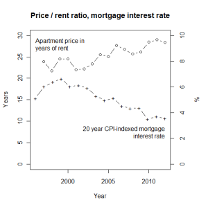
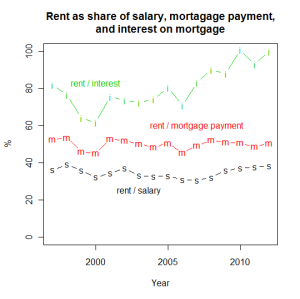
Apartment prices in Israel have gone up significantly in recent years. In the years 1996 to 2008, an average apartment cost about 100 average salaries. Within two years, this ratio has gone up to about 130. This rise can be explained to a significant extent by the reduction in interest rates, which implies that a given mortgage payment can repay higher loans. The interest rate on an indexed 20 year mortgage has fallen from about 6% in the late 1990’s and early 2000’s to about 3.5% in 2010 to 2012. As a result, despite the 30% increase in apartment cost to salary ratio, the ratio of the monthly payment on a 20 year loan for the cost of an average apartment to the average salary has gone up much more moderately – from about 70% to about 80%.
The fact that the increase in apartment prices is associated with a decrease in interest rates raises the possibility that a future rise in the interest rates (which would bring them close to historical rates) would cause a return of the apartment cost to salary ratio to its previous level.
Data sources:
- Average monthly salary (nominal): Social security data (social security law, section 1), similar to statistical abstract 2012, Table 12.34, but more up to date, using the January 1st 2013 entry as reflecting 2012 data, etc.
- Consumer price index (CPI): Israeli central bureau of statistics (CBS), series 120010
- Average price of apartment owned by its residents: CBS series 020000
- 20-year mortgage CPI-indexed interest rate: Bank of Israel data, using the “20-25 years” column for recent years and the “above 20 years” column for pre-July 2011 entries
Co-authored with Daniel Gat.
Israeli settlement in the West Bank and Gaza
May 4, 2013
Note: The data here do not include settlers and construction in the eastern neighborhoods of Jerusalem, i.e., those areas of the West Bank that are included by Israel in the municipal boundaries of Jerusalem.
Data sources: Statistical abstract of Israel, various years; B’tselem report, By Hook or By Crook. Table 1 (based on Statistical abstract of Israel, various years). Data: 1, 2.
The rise of Haredi electoral power in Israel
January 26, 2013
[Updated March 2021.]
The increase of the Haredi (Jewish ultra-orthodox) population in Israel is a topic widely discussed in Israeli mass media and with considerable sway over Israeli politics both in the form of increasing Haredi electoral power and in the form of providing campaign and policy agendas for opposing forces.
Official statistics (social security annual report 2011, charts on pages 139, 140) indicate that the average Haredi family has about 6 children (with a decreasing trend over the last two decades) while non-Haredi Jewish families have about 2.5 children. Talk about demographic trends caused by the differential fertility rate, causing an imminent “Haredi and Arabic” majority, is quite common. This is coupled with complaints about the fact that Haredi labor force participation rate is low, the fact that Haredim do not serve in the Israeli military and the fact that some Haredim receive stipends from the state as rabbinical students.
The chart below shows the proportion of votes received by Haredi parties in Israeli elections.
Data: text file, Google spreadsheet. Source: The Israel Democracy Institute.
Party affiliation and general outlook 1991-2011
May 24, 2011
The proportions of Americans who are politically affiliated with one of the two major parties has been very stable over the last 20 years, at about 60% with a slight downward trend (+ marks and thick trend line in the chart below). Over the same period, the general outlook of the public has fluctuated wildly, with those who say the country is “going in the right direction” reaching over 50% at one point and falling 5 years later to 20% (circles and thin trend line). The public mood seems to be optimistic immediately following presidential elections (vertical dashed lines), and pessimistic immediately before them.
Data source: New York Times/CBS poll, April 15-20, 2011.
Medical Doctor degrees conferred in the U.S.
April 18, 2011
The number of Medical Doctor degrees conferred in the U.S. has remained unchanged since 1985 – about 15,000 degrees a year. Therefore, the number of MD degrees conferred per U.S. resident has fallen since 1985 by the same rate as the growth of the population – about 25% cumulatively.
That period has also seen a significant increase in the median MD earnings, as measured by the BLS (Current Population Survey – CPS, Weekly & Hourly Earnings): In the decade between 2000 and 2010, physicians and surgeons have seen their nominal median income increase 51%, while lawyers saw an increase of 37%, and the average worker saw an increase of 30% (series LEU0254541000, LEU0254536800, LEU0252881500). The 30% increase, incidentally, represents a 2.5% inflation-adjusted increase according to the BLS.
Data source: Statistical Abstract of the U.S. 2011 edition, Table 300 (spreadsheet); 1980 edition, Table 293.
Deaths breakdown by cause
February 28, 2011
Data source: CDC, National Vital Statistics Reports, Volume 58, Number 19. Deaths: Final Data for 2007. May 20, 2010. Table 10. Number of deaths from 113 selected causes and Enterocolitis due to Clostridium difficile, by age: United States, 2007.


